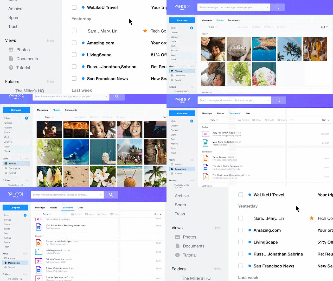
Singapore, June 28, 2017- Whether someone uses Yahoo Mail to communicate with friends and family around the world, as a place to keep their photos and memories from years past, or as a way to organize coupons and receipts from recent purchases – Yahoo Mail’s inbox captures their life online. Today, Yahoo is happy to introduce big improvements to Yahoo Mail on desktop including a refreshed design, and a fast, reliable, and intuitive opt in experience.
Design Refresh
The Mail interface is cleaner and easier to use, with many updates to the layout.
- Themes: Now users can personalize their inbox by choosing from new color themes. Each theme also comes with three different layout options. When someone find the color they like, they can also set the interface to a light or dark mode.
● Less clutter: Now there is more spacing between important items, so the inbox feels less cluttered, and users can easily view and decipher important information.
● Show emotions: People can express themselves using Yahoo’s new emoji set from Twitter’s open source offering, and with new stationery to make their emails more stylish.
A Faster, More Organized Way to Find What You Need
Yahoo is also bringing several new features that make it simpler to find the information people need:
● Photos and Documents Views: The new Photos and Documents views allow people to conveniently see all the attachments they’ve ever sent or received. When someone want to look at a specific document, they can use the new side-by-side preview which allows them to view attachments and the email together.
● Fast and responsive interface: Yahoo uses the latest web technologies to make the whole experience faster from the moment the user login. Every part of the interface is faster and more reliable, particularly for slower connections. Yahoo Mail also behaves smarter in recognizing different screen sizes, no matter how small or how big the screen. The responsive design keeps the key elements of the interface in the right place. To learn more about the modern tech behind this update, click here.
● Better Search (Conversation and Preview pane): Now people be able to view the search results page the same way they’ve specified in their “viewing email” settings. For example, if they use conversation mode, now the search results page will show results in conversation mode instead of in a flat message list. If they’ve selected their preview pane to display on the right, it won’t move when they’re in the search results page.
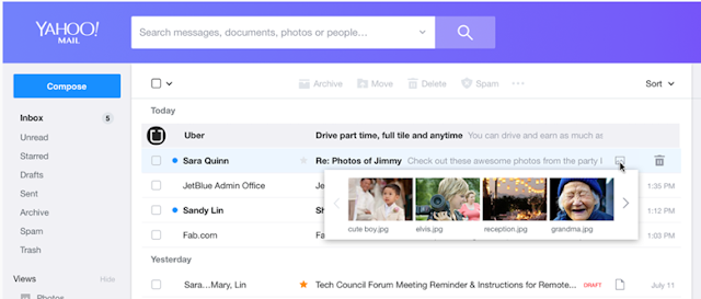
● Rich Preview: Hover over the image icon to view the photos, documents, etc., attached in an email.
Personalize Your Inbox, So It’s Tailored to your Preferences
Yahoo has added even more personalization options, so it’s much easier to customize inboxes to fit people’s needs:
● Simple and easy settings: Too often in apps the settings are an afterthought, making it hard to customize things just the way people like them. Users will be happy to see that Yahoo have put as much effort into making the settings area clean and easy to use, as they did the rest of the interface. So now customizing Yahoo Mail is simple. As people change settings, the interface responds instantly, so they don’t have to guess, save or cancel their changes.
● Enjoy Yahoo Mail Pro: A few years ago Yahoo introduced Ad Free Mail, giving people the option to opt into a completely ad-free Mail experience with the purchase of a yearly subscription. Now, Yahoo is improving this offering with Yahoo Mail Pro, a more cost-effective ad-free subscription plan that comes with priority customer support. Available now on both desktop and mobile. Read more about Yahoo Mail Pro here.
● Choose the inbox that suits you best: While Yahoo hopes that people will love the new desktop experience, if they opted into the new Yahoo Mail experience and want to switch back to classic desktop Mail, they can always go to Settings and select “switch to classic mail” at the bottom.
Accessible to All Users
Yahoo want to ensure that all users can enjoy their upgraded email experience. They’ve incorporated full inbox access for NVDA and VoiceOver screen reader users, and provided options for light-sensitive and low-vision users, layouts for use with high magnification, and full keyboard navigation for alternative input devices. To learn more about these improvement, visit Yahoo’s Accessibility blog post here.
The new desktop experience is available for global English-language users to opt into starting today, with additional languages to follow. More information is available at https://upgrade.mail.yahoo.com/. To provide feedback, simply click on the Give Feedback call out in the lower left corner of the new version of Yahoo Mail.
For the LATEST tech updates,
FOLLOW us on our Twitter
LIKE us on our FaceBook
SUBSCRIBE to us on our YouTube Channel!


