When you’re competing against giants like Apple, Google, and Samsung, being a newbie in the smartphone market is no walk in the park. Despite the challenges, Nothing managed to make a mark by selling over half a million Phone (1)s last year. Now, they’re back with their latest offering: the Nothing Phone (2).
While the Phone (2) maintains a familiar design, there’s a distinct sense that Nothing is hitting its stride. The new model boasts a considerably faster CPU, upgraded camera capabilities, and a more intentional and thoughtful user interface, reflecting Nothing’s unique vision. Notably, the Glyph interface, a standout feature of the phone, has been enhanced for better customization and functionality.
In a market flooded with Android phones that often seem indistinguishable, let’s see if the Nothing Phone (2) truly stands out from the crowd.
Specifications
| Display | 6.7-inch OLED (2412 x 1080, 394ppi) |
| Refresh rate | 120Hz |
| Chipset | Snapdragon 8 Plus Gen 1 |
| RAM | 8GB/12GB |
| Storage | 128GB/256GB/512GB |
| Rear cameras | 50MP (f/1.88) main; 50MP ultrawide (f/2.2) |
| Selfie camera | 32MP (f/2.45) |
| Battery | 4,700 mAh |
| Charging | 45W wired, 15W wireless |
| Size | 6.38 x 3 x 0.33 inches (162.1 x 76.4 x 8.6 mm) |
| Weight | 7.09 ounces (201.2 grams) |
| Colors | White, Dark Grey |
The design
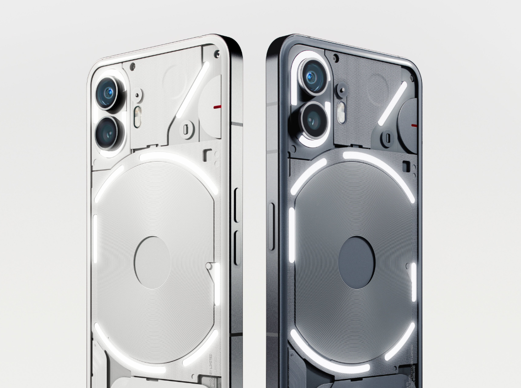
When you compare the Phone (2) to the multitude of phones draped in featureless glass, it’s truly a showstopper. Offered in either white or an elegant new gray hue, its transparent Gorilla Glass back unveils a captivating medley of components.
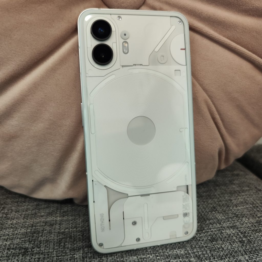
This sneak peek allows you to catch a glimpse of the magnetic charging coil, power cables, and other intricate elements. Despite the complexity, it manages to maintain a clean and organized appearance, and there’s an artistic touch to the arrangement.
Then there’s the Glyph interface, a spectacle in its own right. Comprising several LED strips that dance with pulsating, strobing, and glowing patterns. Nothing didn’t hold back this time, nearly doubling the number of lights from five to an impressive eleven. They’ve also thrown in support for addressable zones, a neat addition that allows for gradient effects to dazzle your eyes. But it’s important to note that the color palette remains limited to white, which might be a tad disappointing for those yearning for more colors.
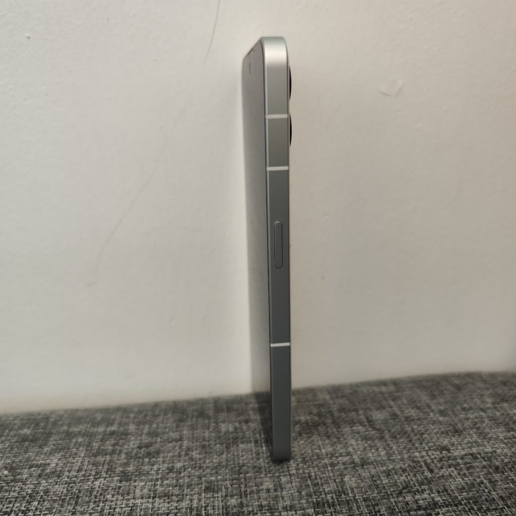
A sturdy metal frame wraps around the device, with squared-off edges lending it a pleasantly boxy appearance. Nothing has opted for 2.5D glass with gently rounded edges on the rear, providing a more ergonomic fit in your hand, molding itself more naturally without causing any discomfort.
The display
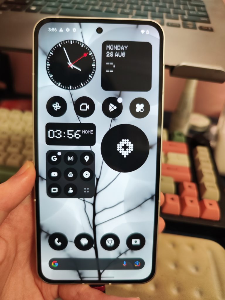
The Nothing Phone (2) boasts a generously larger 6.7-inch OLED display, a step up from the 6.55-inch screen of its predecessor. This upgrade brings along a higher resolution of 2,412 x 1,080 pixels, ensuring a more visually immersive experience.
When you examine the finer points of this 6.7-inch screen, the details stand out with impressive clarity, thanks to its pixel density of 394 ppi (pixels per inch). The colors exhibit a satisfying vibrancy, striking a balance that avoids the excessive saturation seen in certain other phones sporting AMOLED displays.
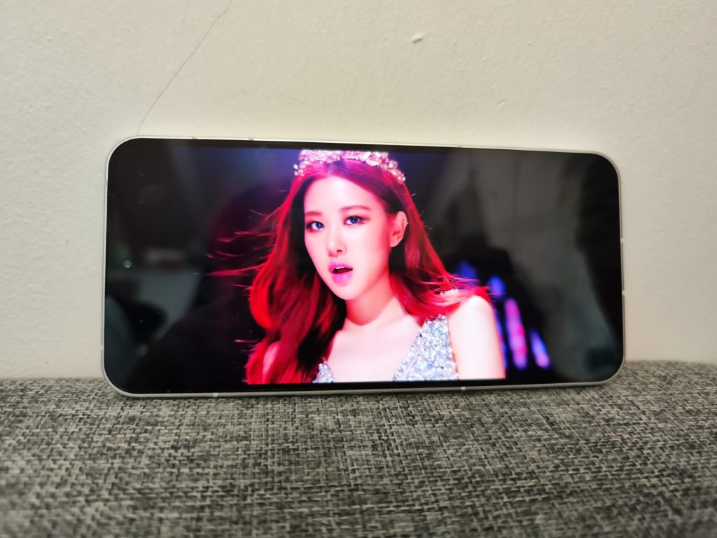
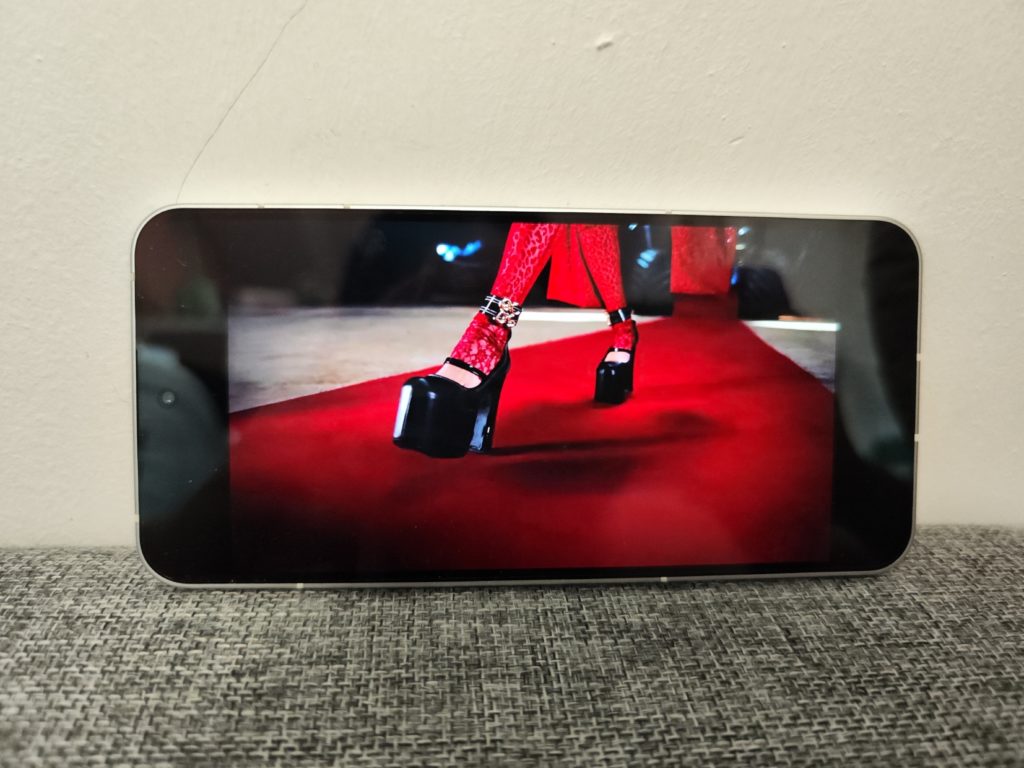
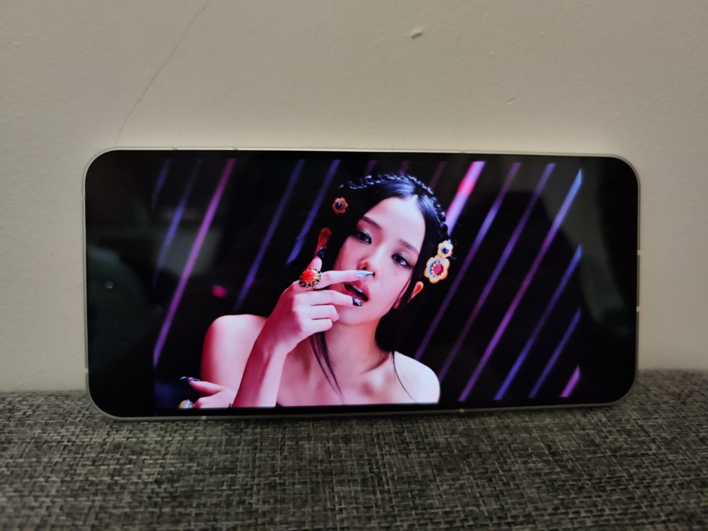
Indulging in video content becomes a delight on the Nothing Phone (2), a testament to its silky smooth 120Hz refresh rate and wide viewing angles. Among the features that particularly appeal to me are the slim (and might we add, symmetrical) bezels that frame the display and the discreet punch hole cutout housing the front-facing camera.
The glyph interface
Right off the bat, the Glyph Interface has undergone significant enhancements, with standout improvements like the Glyph Composer taking the spotlight. This innovative addition empowers users to craft personalized ringtones that are directly tied to the Glyphs.
What’s worth applauding is that Nothing has also gone the extra mile by releasing the Glyph Interface as a standalone app for Phone (1). This thoughtful touch enhances the customization options, making the Glyphs not only more distinctive but also, dare I say, more utilitarian.
The concept of a Glyph Ringtone is intriguing, offering a brief but impactful ten-second auditory experience. The app captures the symphony of tones you experiment with, fostering an immersive exploration. Future updates might benefit from the inclusion of additional mixing and blending tools for those inclined towards creative soundscapes.
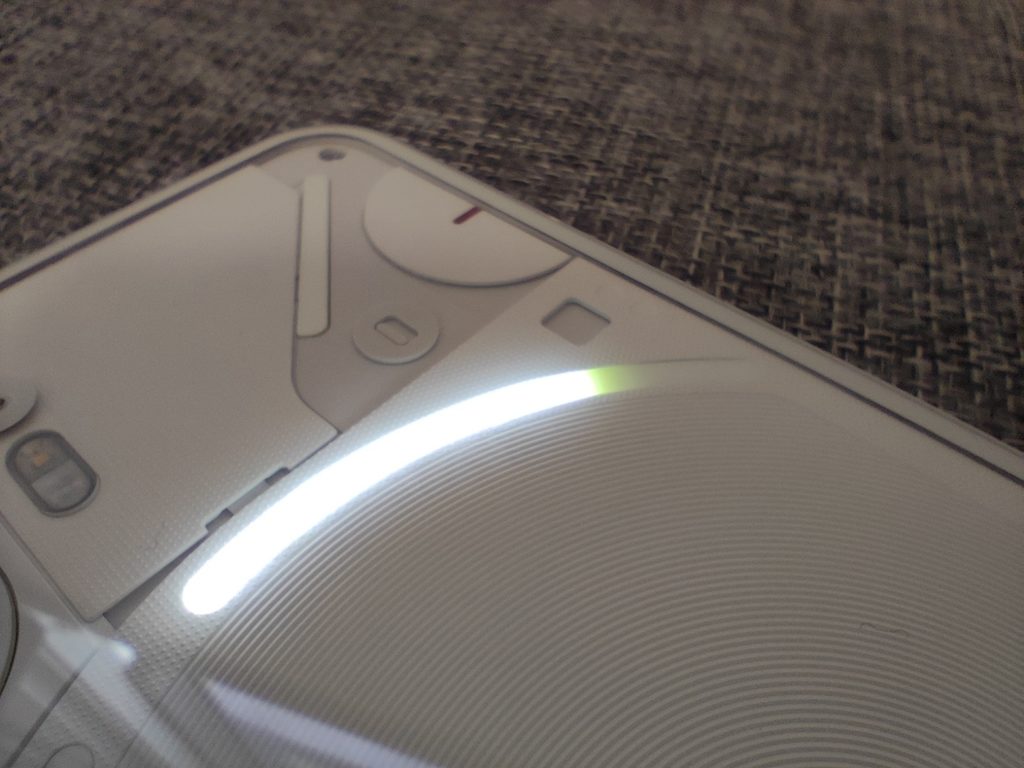
In terms of utility, the Glyph Timer and Glyph Tracker deliver practicality, though they might not be considered game-changing updates. The Timer serves its intended purpose, utilizing one of the rear-panel LEDs to visually signal its completion. The Glyph Tracker presents an interesting notion, potentially linking Phone (2)’s Glyphs to real-world updates such as incoming Ubers (not here in Singapore, though) or, with forthcoming updates, perhaps even pizza deliveries or similar notifications.
The innovative spirit driving these Glyph features is worth acknowledging, serving as a testament to Nothing’s commitment to pushing the boundaries of customization and user engagement.
Performance
Under the hood, the Phone (2) is equipped with the Qualcomm Snapdragon 8+ Gen 1 processor, along with a choice of either 8GB or 12GB of RAM and a maximum storage capacity of 512GB.
Although its chipset may be a year old, it impressively tackles tasks like gaming and photo editing without a trace of slowdown. The synergy between its swift UI animations and a streamlined Android interface contributes to an exceptional level of responsiveness, surpassing even some high-end flagship phones that come with a heftier price tag.
Software: Nothing OS 2.0
While the allure of the design and the captivating Glyph Interface undoubtedly captures attention, the unsung hero of the Nothing Phone (2) lies in its software.
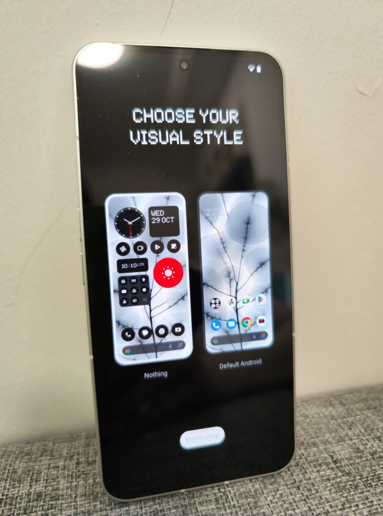
Nothing OS 2.0 retains its signature minimalist aesthetic, which resonates with its earlier iteration. However, innovative Nothing widgets serve to set this skin apart. These widgets play a pivotal role in establishing the phone’s distinct visual identity. Dot matrix-inspired designs are woven into these widgets, showcasing the seamless integration of clean fonts and monochrome icons that seamlessly complement the overall visual narrative.
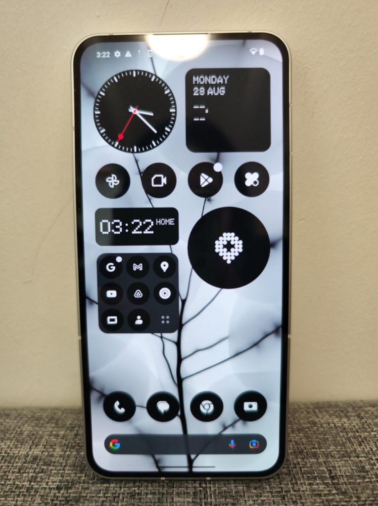
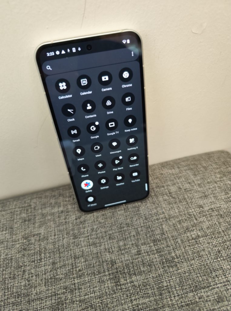
The interface gracing the Phone (2) is nothing short of stunning, gracefully layered atop Android 13. A noteworthy distinction here is that Nothing refrains from piling on unnecessary software features – a contrast I draw with certain other Android phone manufacturers. Instead, Nothing chooses a path of simplicity and clarity, ensuring that even those unfamiliar with the Android ecosystem can effortlessly navigate the landscape of the Nothing Phone (2).
The Monochrome UI also prompts individuals to adopt a more contemplative approach to their device usage. Although, it does take some time to get used to.
Nothing also promises to provide up to three years of Android software updates, extending the life of the Nothing Phone (2) well into the realm of Android 16. In addition, they promise four years of essential security updates.
The cameras
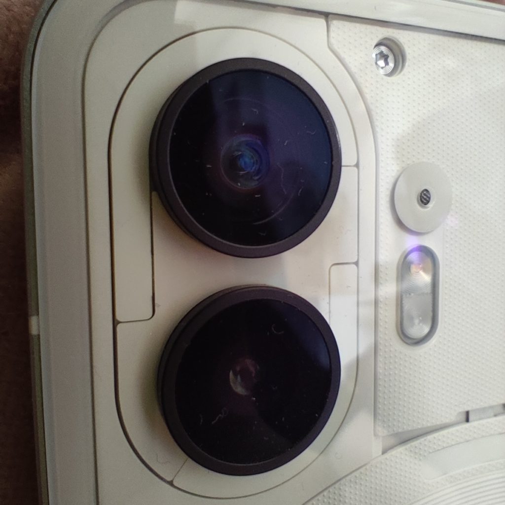
The Phone (2) maintains a camera setup similar to its predecessor, featuring two 50-megapixel cameras on the rear and a 32MP selfie camera nestled within the screen.
A notable improvement is observed across images captured by all the cameras compared to the previous model. The primary camera excels at producing well-balanced images in bright lighting conditions, a feat also achieved by the wide-angle counterpart. However, akin to its predecessor, these images tend to lose a bit of sharpness and detail when examined at their full size. This becomes evident with some blurring of moving subjects and an evident smoothing effect, particularly when dealing with challenging lighting scenarios. The Phone (2) doesn’t incorporate a dedicated telephoto camera.
Video recording stands as a commendable aspect, offering solid performance for its price point. Its optical and electronic stabilization kept the footage smooth. It comes with a handful of entertaining features to experiment with, including the fun option of capturing slo-mo footage at an impressive rate of up to 480 frames per second.
Here are some photos taken on the Nothing Phone (2):
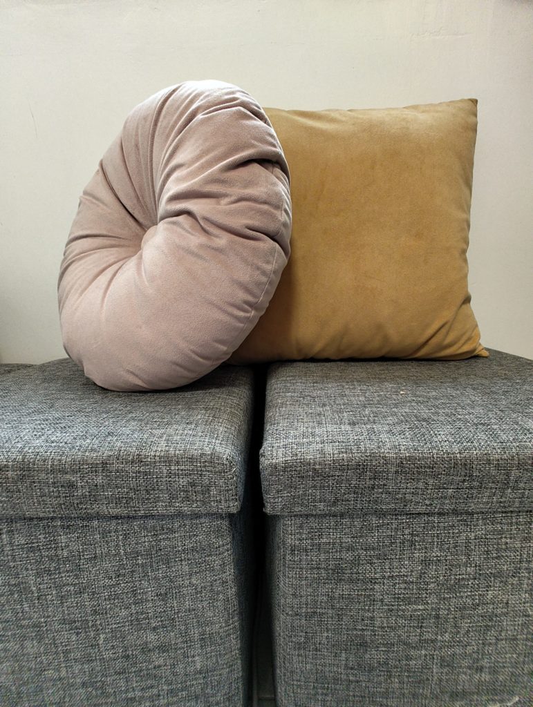
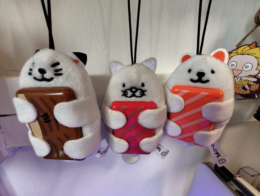

Colors are crisp and contrast well. Details are also not lost.


For day shots, the Nothing Phone (2) managed to capture photos that were clear and precise. While the colors on the photos weren’t as vibrant as what you’d be used to on Samsung and Xiaomi phones, we felt that it was more true to life.


The Nothing Phone (2) automatically switches to night mode in low-light settings. The phone is able to capture good enough photos at night, with minimal loss of details.
Battery life
Battery performance on the Nothing Phone (2) proves to be commendable, offering a solid experience with a full charge often stretching across a day and a half in my personal usage. The phone boasts a quick charging feature, promising a full charge in just 55 minutes. However, it’s worth noting that this isn’t the swiftest option within its segment. For users considering this feature, it’s important to keep in mind that Nothing offers its own 45W PD power adapter, which does come at an additional cost.
All in all, the Nothing Phone (2)’s battery performance showcases its reliability, comfortably navigating through a day and a half of regular use and displaying resilience during demanding scenarios. While the rapid charging is a plus, the requirement for a separate power adapter is a factor to weigh when considering its convenience and value.
The Nothing Phone (2) also supports up to 15W wireless and 5W reverse charging speeds.
Pricing and availability
The Nothing Phone (2) is priced from $999 and is available here.
Verdict
In an era where each new phone generation often struggles to match the excitement of its predecessor, Nothing has remarkably achieved the feat of making the Phone (2) truly stand out.
The captivating design it boasts captures the essence of the beloved transparent plastic devices from the nostalgic ’90s era, but this time with sophistication.
Simultaneously, a simple yet exciting OS sets the phone apart from the rest. Nothing also empowers users with innovative tools like the Glyph interface, which introduces a fresh paradigm for presenting information and notifications. This fusion of aesthetics and functionality injects a unique charm into the Phone (2)’s user experience.
All these and more make the Nothing Phone (2) a noteworthy contender in a crowded market.


