About a month ago, Nothing, a London-based consumer technology company founded by Carl Pei (co-founder of OnePlus), held its “The Truth” event, promising wide-eyed fans that we’d be able to get our hands on the brand’s very own (and supposedly revolutionary) smartphone software before the end of April.
True enough, Carl delivered on his promise – the new Nothing launcher (Beta) is available for download on the Play Store albeit only for Pixel 5/Pixel 6 or Galaxy S21/S22 owners.
Before you jump over to the Play Store, let’s take a look at the Nothing launcher (Beta) and what it has to offer.
The home screen
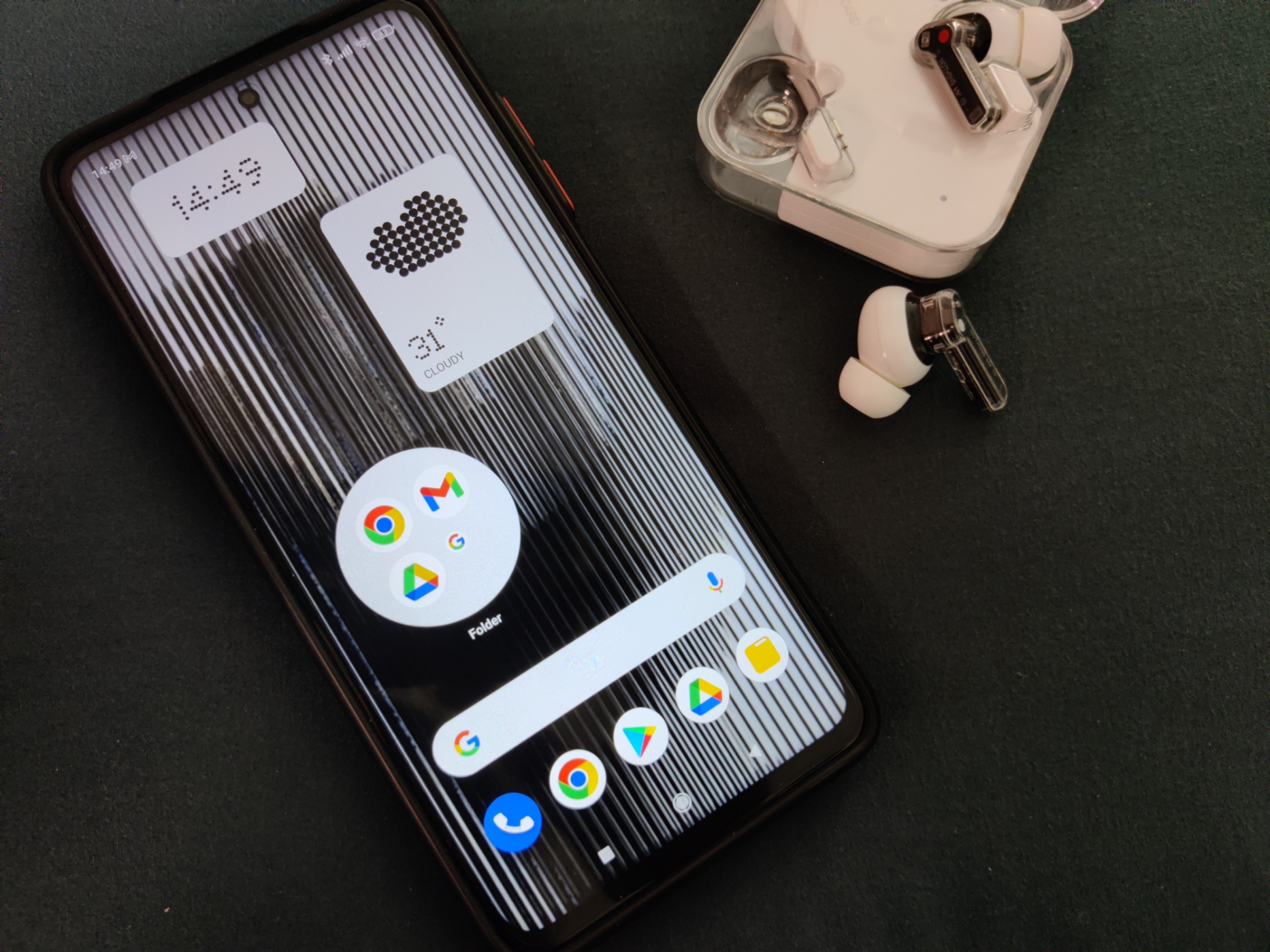
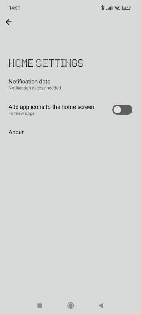
Perhaps realising that Android fans will be the main bulk of their customers, Nothing’s phone launcher looks a lot like the Pixel launcher. At the time of writing, the launcher settings consists of 2 basic options – to show notification dots on app icons and add newly installed apps to the home screen.
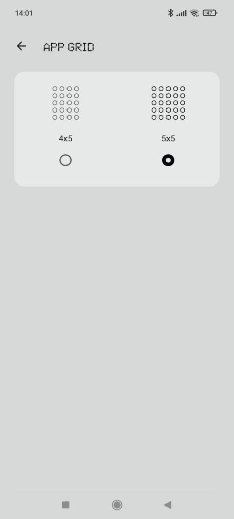
When you enable the launcher, you’ll get a neat and clean home screen in a 4×5 layout, with a few pre-installed Google applications. The Google search bar sits right above the bottom dock. I was unable to remove it or move it around, which is pretty annoying. The layout may also be adjusted to 5×5. Doing so did not make the screen appear too cluttered.
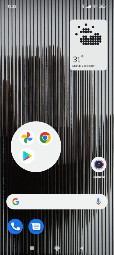
Nothing’s default icon is circular and are well-spaced. Third-party icon packs are also supported by the launcher. You can also enlarge app icons (Max icon) and group them up into a Max folder. To place apps into a Max folder means that three of the apps in the folder are still tappable and you can tap on a smaller collection of more apps in the bottom corner to access the full folder. Doing it is easy and rather intuitive.
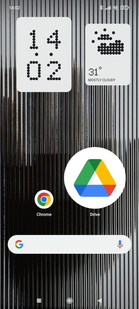
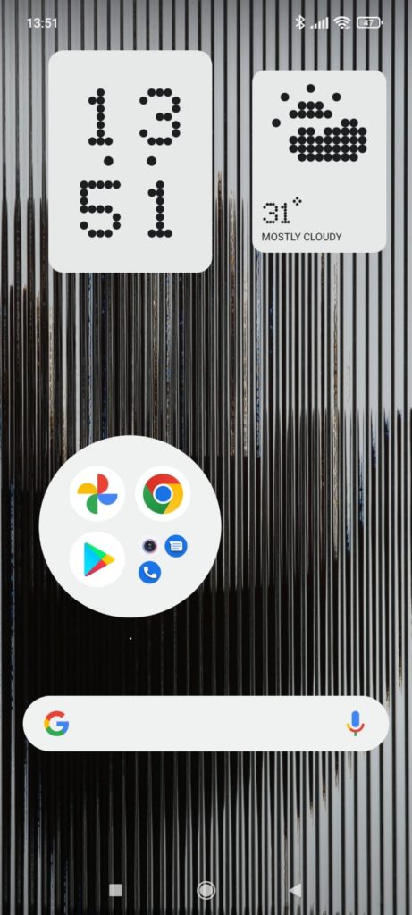
While that is a cute nice-to-have feature, it really isn’t all that great. For one, you don’t have the option to fine-tune the size of the icon – it’s either normally sized or crazy huge. Furthermore, if you decide to place all of Nothing’s custom widgets (more on that later) on your home screen, you won’t be able to squeeze in any Max icons or Max folders onto your screen. There’s just not enough space.
The app drawer
The app drawer is an essential element of a launcher. Nothing’s app drawer can be accessed by swiping up on the home screen.
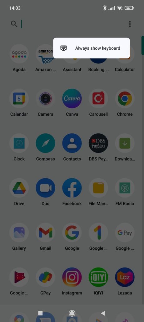
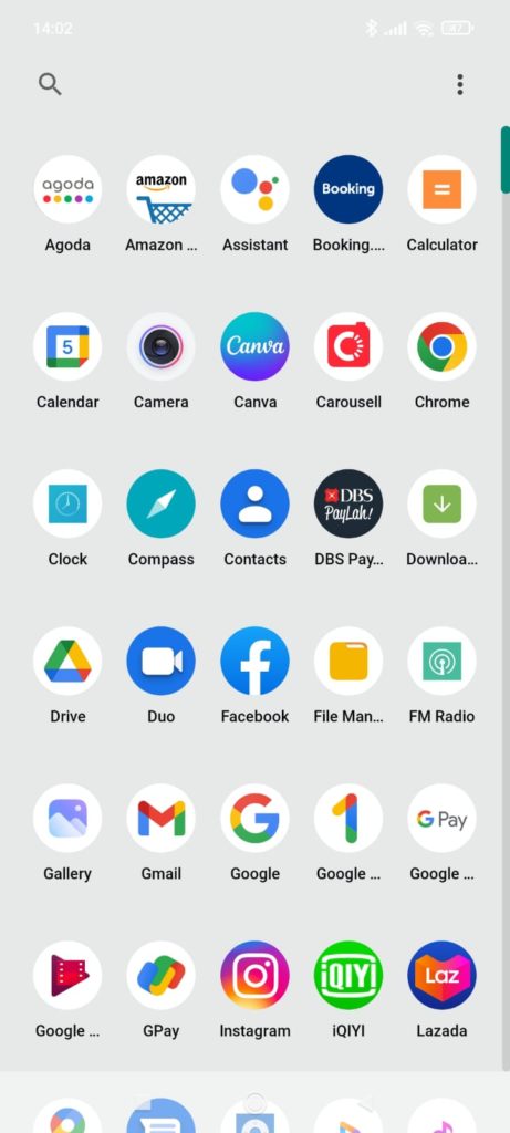
There is an option to ‘Always show keyboard’ which, when enabled, automatically reveals the keyboard whenever you swipe open the app drawer. It’s nothing new, but it’s useful for you to search for the app you want instantly.
Overall the app drawer is pretty snappy and I don’t have any complaints about it. That being said, there really isn’t anything to rave about it either. It is a pretty basic app drawer with few customization options as of the Beta version of the Nothing launcher.
The wallpaper
The launcher comes pre-applied with Nothing’s characteristic wallpaper. I’m not a fan of the wallpaper – the hand is quite creepy. In fact, the wallpaper, because of its color, affects the visibility of text and widgets.
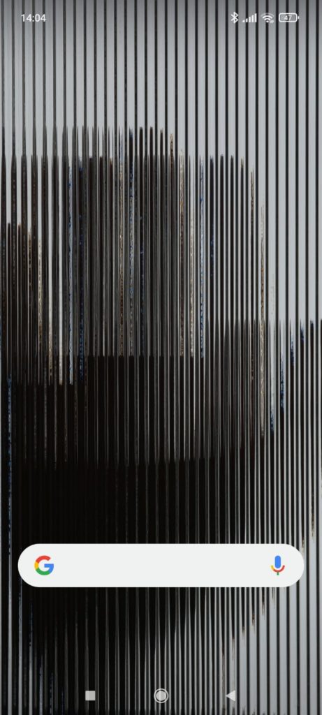
If you’re keen or hardworking enough, you can download more wallpapers from a Dropbox folder that Nothing has shared on its Discord server.
The widgets
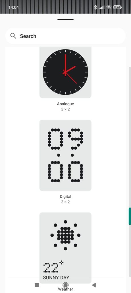
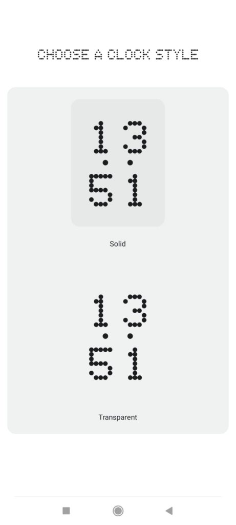
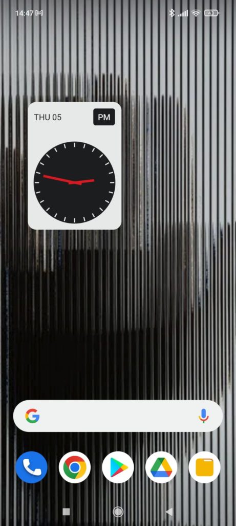
The collection of custom widgets provided by the Nothing Launcher is arguably its most appealing feature. Currently, only three widgets are available: a digital clock, an analog clock, and a weather widget. Nothing’s signature dotted-line typeface features on the digital clock and the weather widget.
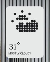
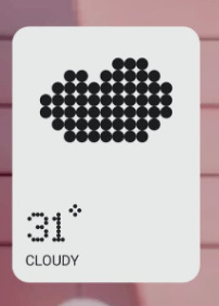
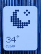
While I can see why this nostalgic-looking digital typeface and design could be attractive to some, I’m not really a fan. In fact it took me awhile to understand that the dots on the weather widget is supposed to look like the sun behind a cloud.
Concluding remarks
The Nothing launcher is a simple launcher that does its job. It’s quite a shame how the brand hyped the launcher up so much at its recent event. At this stage, it offers nothing much to be excited about. In fact, if this is their ploy to get fans excited about the Nothing Phone (1), I’m worried about what the phone really has to offer.
That said, we have to keep in mind that this is just a Beta version of the Nothing launcher. We can only hope that much (much, much) more improvements will be made before the launch of the brand’s first phone.


