Yahoo Finance and Homepage in Singapore Get a New Look!
Refreshed sites to provide Singaporeans quality content in an easy to use interface
Singapore, May
23, 2017 – Today Yahoo announced
the new Yahoo Finance and Yahoo Homepage for users in Singapore. With
cleaner, more modern designs and a focus on increased personalization, the new
sites deliver a continuous stream of articles tailored to each user and create
a more consistent experience on Yahoo properties across devices.
Here are some highlights:
Yahoo Finance:
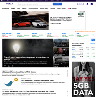
Investors in Singapore can look forward to bigger headlines and
photos in the recently updated Yahoo Finance site – allowing them to keep track
of their Singapore and global equities more easily while continuing to access
real-time data, editorial insights and analysis, breaking news and video.
photos in the recently updated Yahoo Finance site – allowing them to keep track
of their Singapore and global equities more easily while continuing to access
real-time data, editorial insights and analysis, breaking news and video.
The watchlist, portfolios and popular market data such as top
gainers and losers have been consolidated into a configurable dashboard where
users can add, remove and reorder stocks directly on the homepage. Users can
jump between interactive charts with just a click on the ticker on the
watchlist. New data visualizations in the right rail provide a quick company
performance summary, while a new “View Watchlist” button allows for stocks to
be viewed on any quote page without navigating away. And instead of 15 fixed
headlines, there is now an infinite stream of content on the quote page, with
related articles grouped into clusters, similar to the homepage. Users can also
find an earnings and economic events calendar under the market data section and
insider transactions information under every quote page.
An exciting new feature is the new community-centered
“Conversations” section available on each quote page. Message boards have
become a more modern social experience where people can discover trending tags
and will be able to post charts and images to express their ideas. Relevant
conversations from articles will also appear to help users discover what is
being said about companies anywhere on Yahoo.
Yahoo Homepage
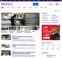
The new Yahoo homepage is designed keeping user behavior in mind. Yahoo has made it easier for users to get all the latest news and content, in less time. People no longer need to open individual articles in multiple browser tabs; instead, they can simply scroll through related stories inline. They can also engage in conversations and share what they are passionate about with a tap, and follow topics of interest across devices.
Up top, Yahoo editors pick some of the most important stories people need to know, alongside content most relevant to them. Users can like their favorite articles by clicking on the heart icon. Over time, as people click on more content, the Yahoo stream becomes more tailored to individual interests.
The new upgraded design for Yahoo will provide users with a new experience which includes considerably faster page load and more seamless surfacing of slideshows, videos and original content.
Yahoo will continue to provide the same quality content its audiences all over the world have come to expect. This major redesign of the homepage and core properties lays the foundation for many upcoming new features across platforms, harnessing the full power of Yahoo to create a unified experience across desktop and mobile web.
For the LATEST tech updates,
FOLLOW us on our Twitter
LIKE us on our FaceBook
SUBSCRIBE to us on our YouTube Channel!


