Nothing products can always differentiate themselves among similar products in the market due to their unique style and design. True to being different, they have released smartphones and earphones that look like no other. Previously, the Nothing Phone (1) and (2) were positioned as contenders within the mid to high tier markets. They managed to garner some attention, but in order to reach a wider audience looking for a more affordable smartphone, they released the Nothing Phone (2a). Without losing all the “coolness” that Nothing brings to the phone, can the (2a) be decent smartphone that’s worth your consideration? We’ve had the phone to close to three months now, and here’s what we got to say.
The “Nothing” factor
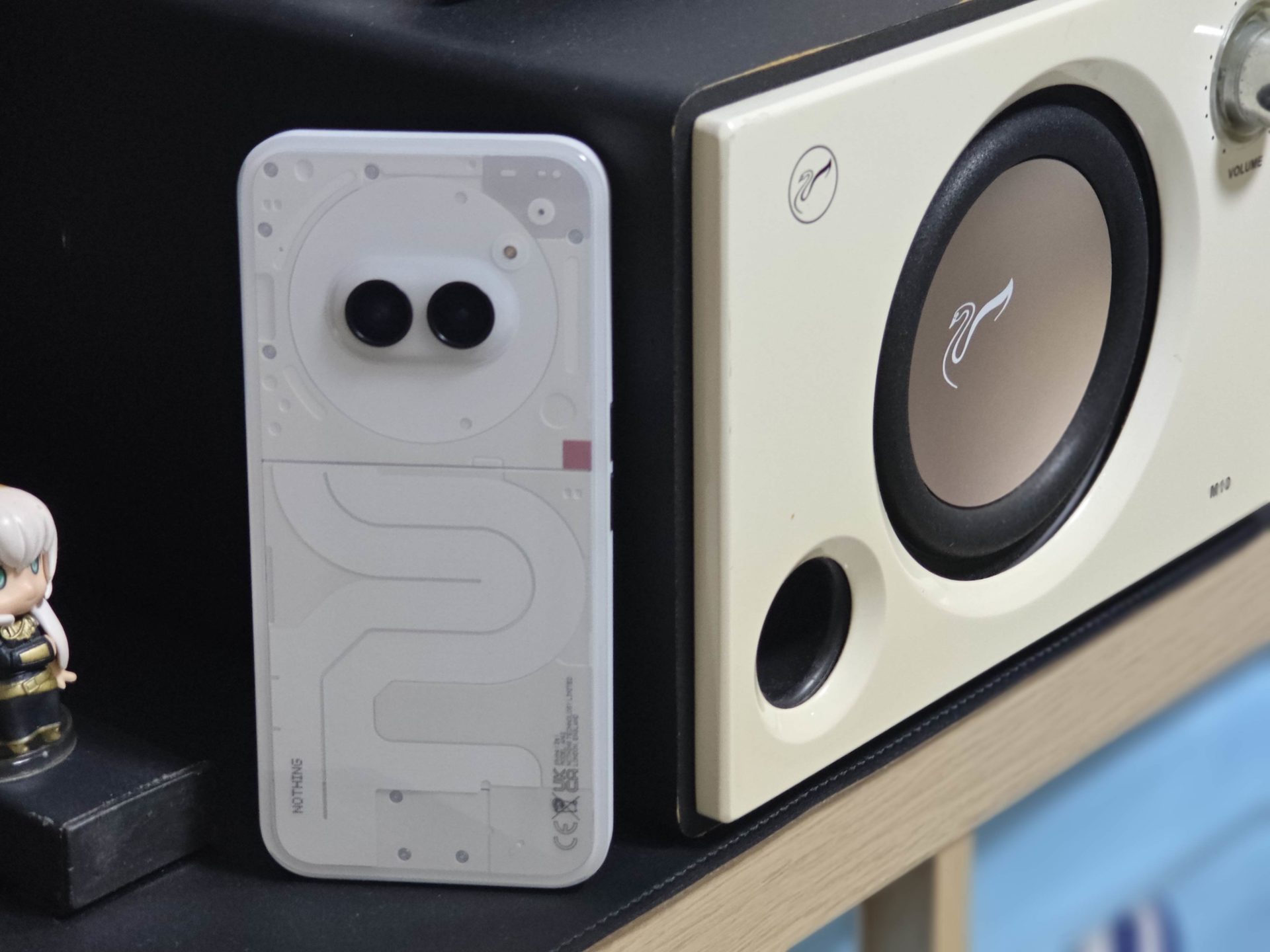
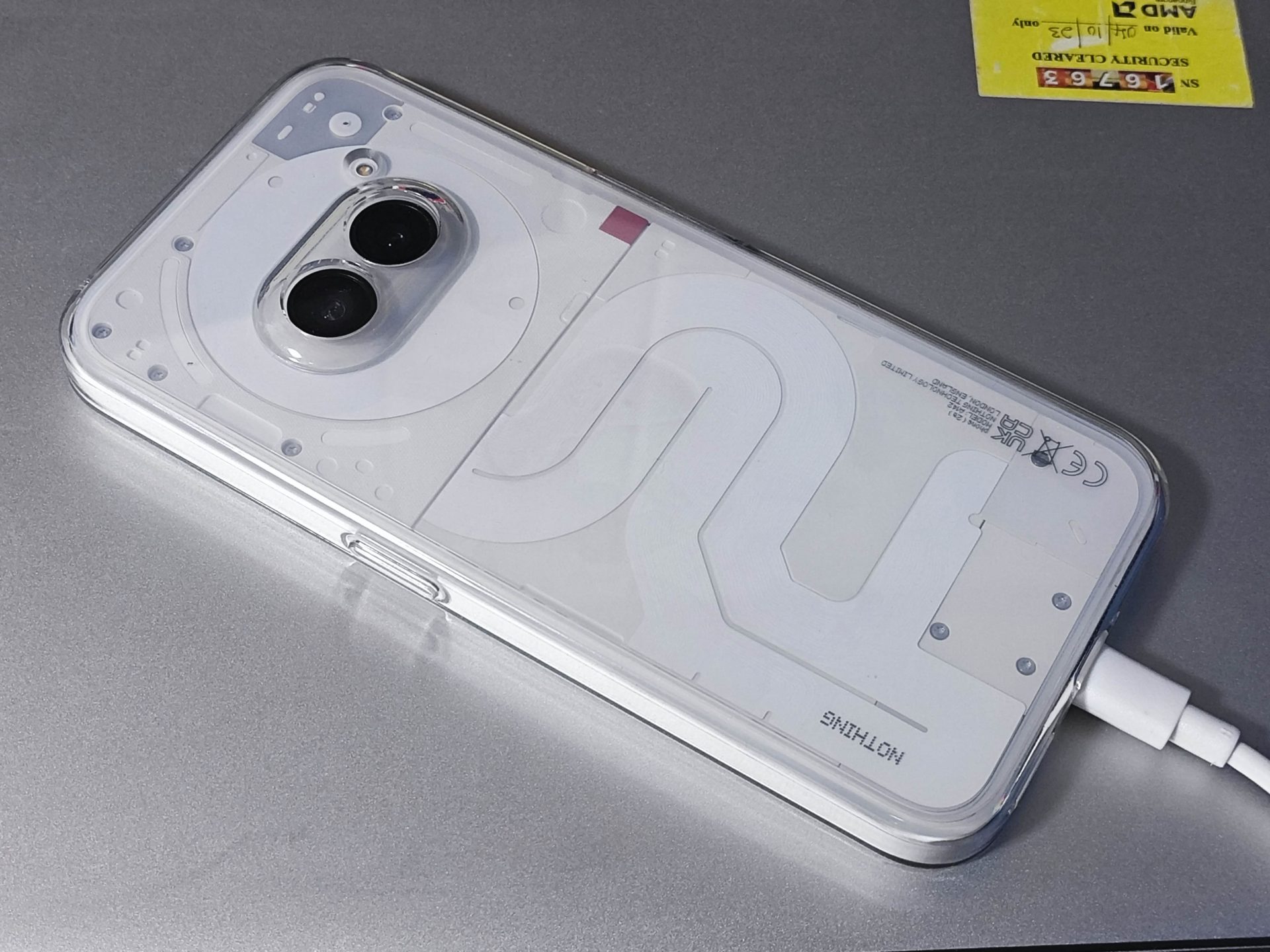
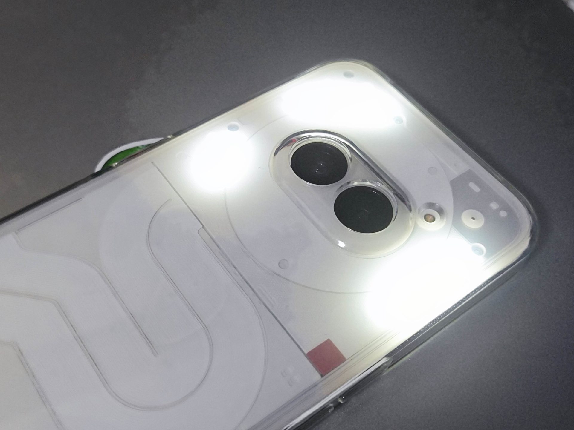
True to its blood, the Nothing Phone (2a) simply stands out. Forget about how your usual Pixel, Samsung or iPhone looks. Nothing smartphones spots their signature futuristic look with the Glyph interface – same for the Nothing Phone (2a).
The Glyph interface is more than just a cool light show at the back of the device for you to show off to your friends. It does genuinely have practical usage to it. For example, the Glyph interface can show a variety of light patters as visual notifications for calls, messages, emails, app alerts, etc. It allows the users to see at a glance what kind of notification they have received without having to pick up the phone. These light patterns can even be customizable based for different contacts or apps.
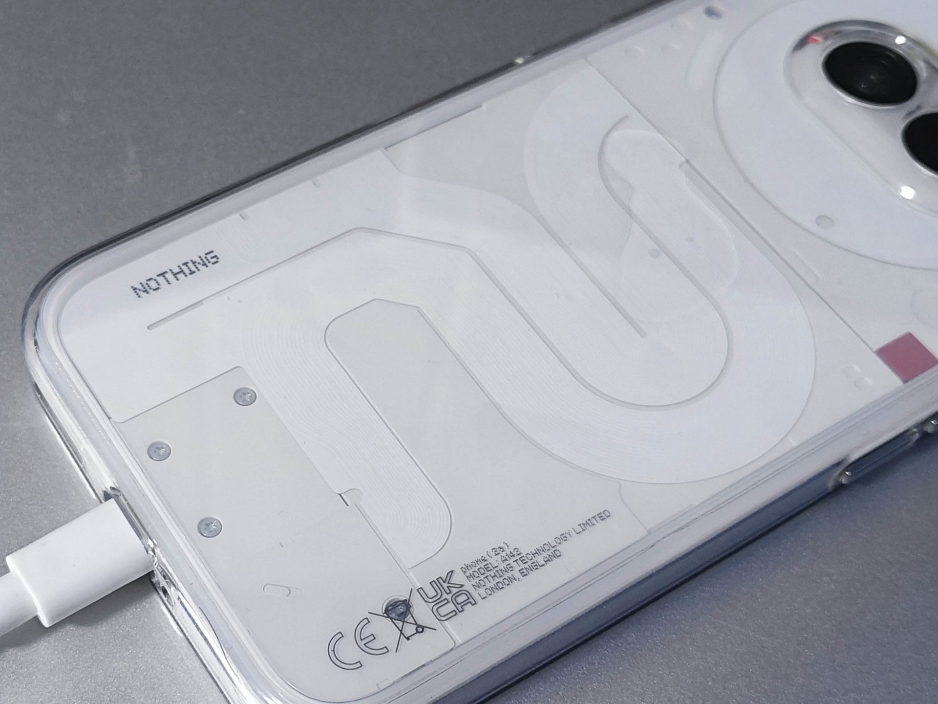
What’s cool is that this lights seamlessly integrates into the transparent back of the phone. It accentuates the phone’s minimalist and futuristic design.
Nothing OS
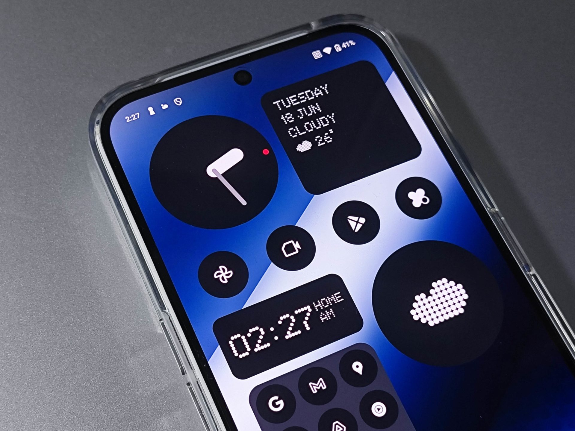
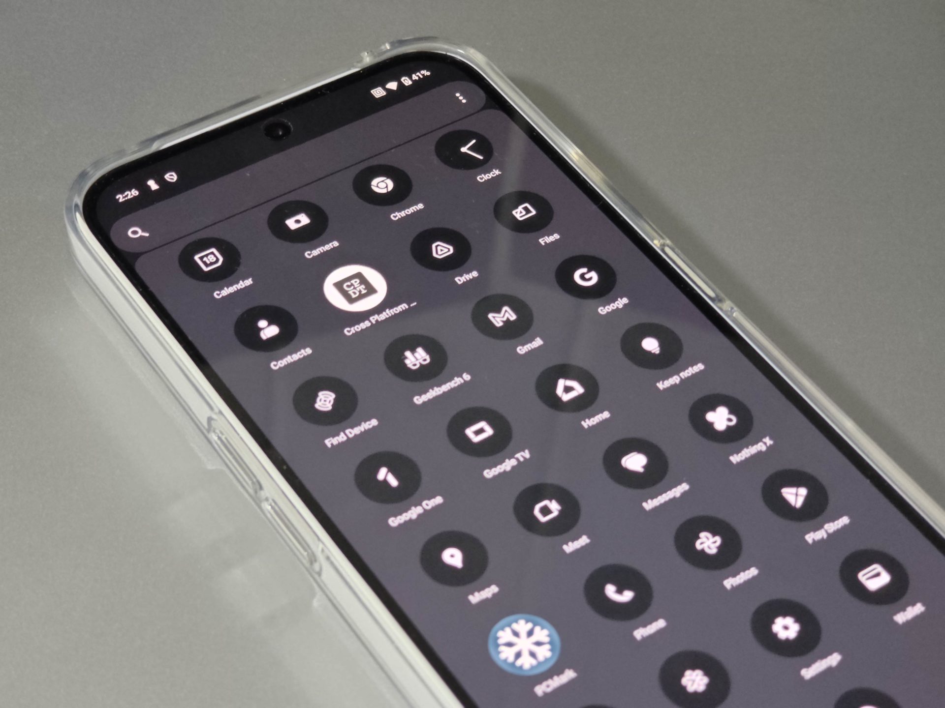
The Nothing OS on the Nothing Phone (2a) is a masterclass in minimalistic design and fluid performance. Stripping away the unnecessary, it delivers a pure Android experience with lightning-fast speeds and seamless interactions. What we liked about the user interface is its clean and intuitive interface. There’s no bloatware on the phone, just a straightforward and user-friendly UI that lets you focus on what matters most.
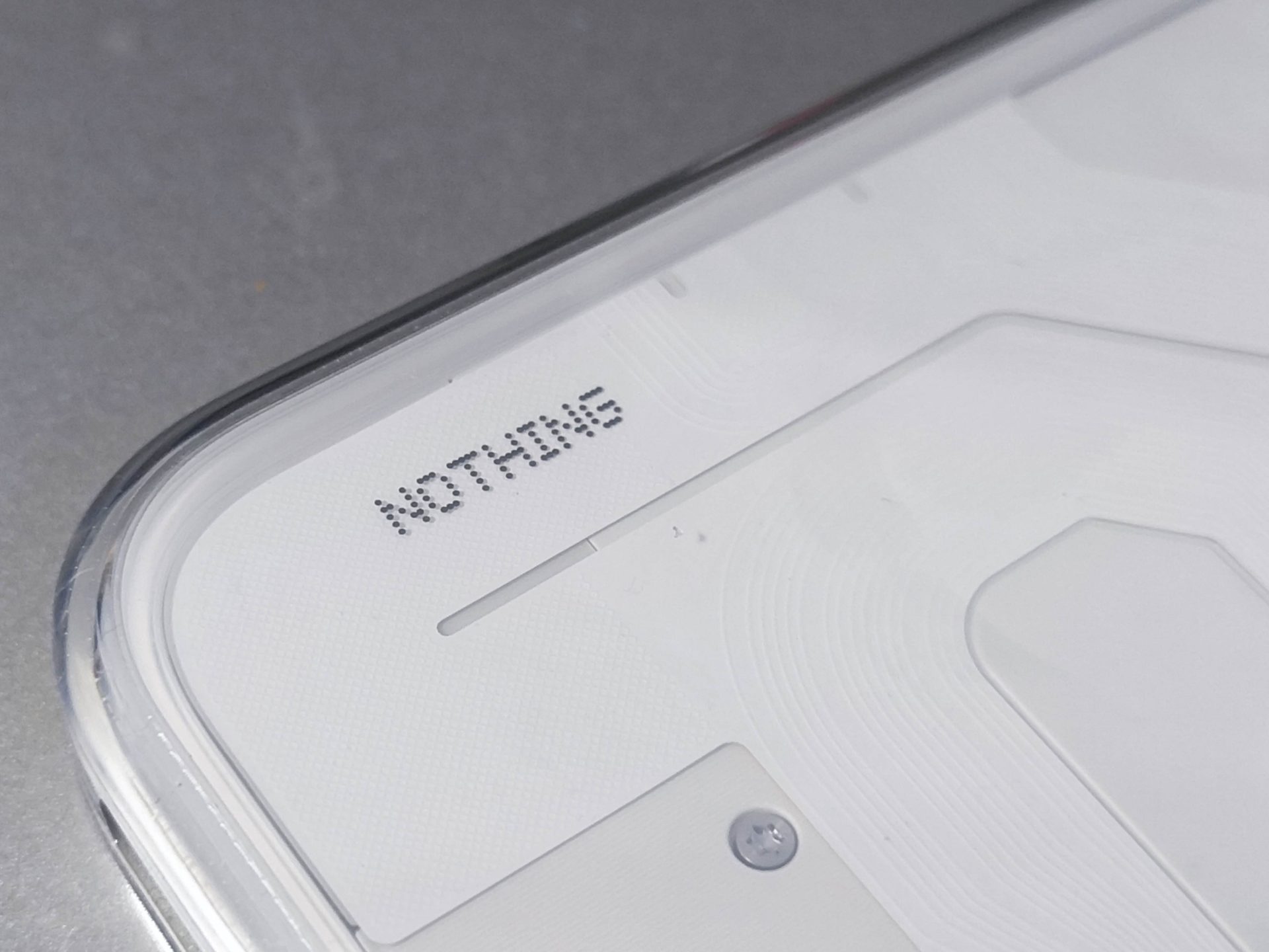
Inspired by dot matrix typography and retro tech aesthetics, it gives a fresh, nostalgic feel while remaining contemporary. However, I must say that I needed some time to get used to an UI that’s this minimalistic (call me old school).
Superb User Experience
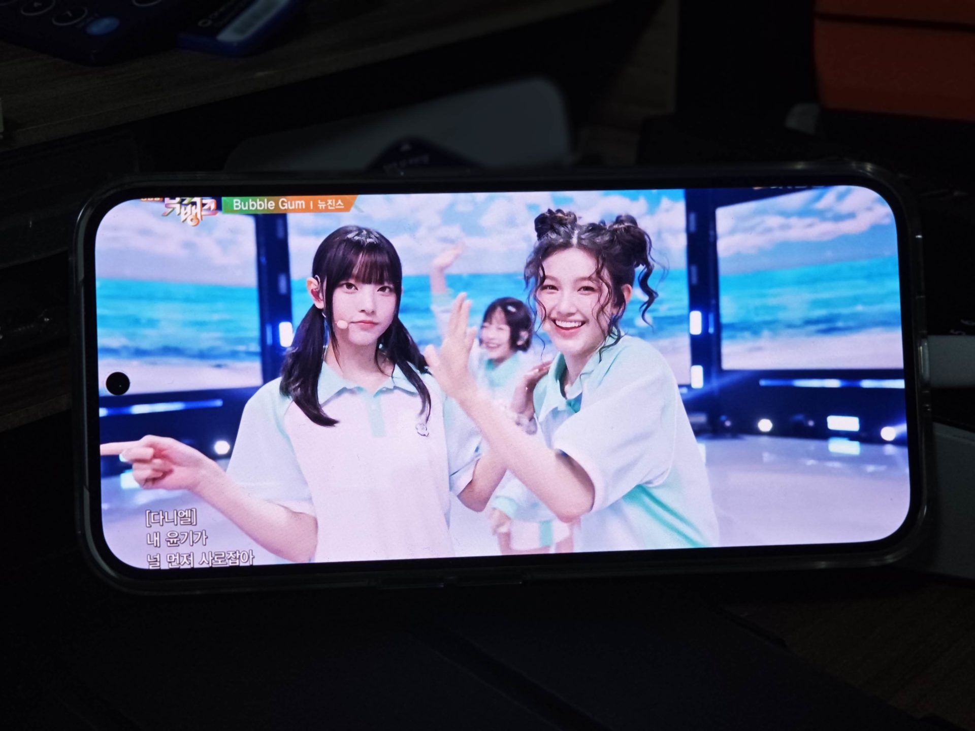
One of the first impressions you get from the Nothing Phone (2a) is its large screen to body ratio. What you get is a large screen right in your face, away from distractions or odd design quirks seen on other smartphones. Its rounded edges of the screen fits well into the overall design of the phone. Despite the phone being a more affordable option to the Nothing 2, it does not compromise on its features and capabilities. The Nothing Phone (2a) still features an display with AMOLED technology, which means you’ll get that superb high contrast ratio experience – blacks are truly black, and the colours really pops.
Equipped with the MediaTek Dimensity 7200 Pro chipset, the Nothing Phone (2a) is made to perform. As the chipset is made with a 4nm technology, it has got an advantage over efficiency when compared to the other smartphones. That’s why we were simply surprised by the battery life of this phone. It can really last very long – based on our tests running PC Mark Work 3.0, it reached 16h 29 min. That’s the longest we’ve ever tested.
It doesn’t mean that being equipped with a MediaTek chipset will result in poor performance. Current day MediaTek processors are just as performant as their competing counterparts, if not better, in the mainstream category. Sometimes, if not going for the best of the best performance, MediaTek products are even preferred over others. With a good performing chipset coupled with the phone’s capabilities to run its display at 120Hz, the phone appears to be extremely responsive. I didn’t have any problems with the smartphones on its performance, and there wasn’t any instance where the phone lagged or appeared slow.
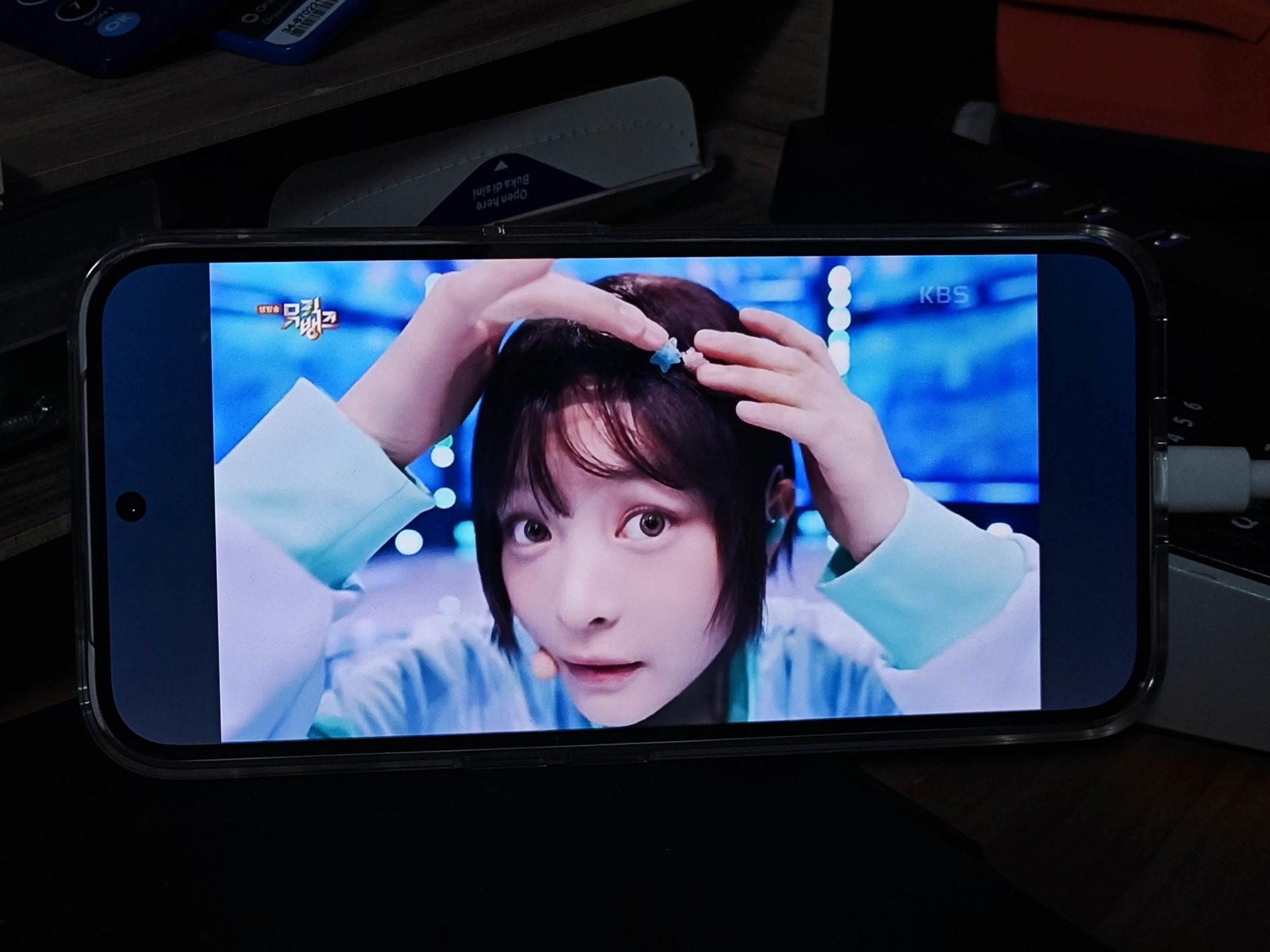
It’s also a pleasure to consume content on the Nothing Phone (2a). Pairing with a high quality AMOLED display with high quality stereo speakers, I was able to really enjoy my movies and YouTube videos playing on the device. Audio from the device is clear, and brings an immersive experience to the shows which I was watching. Frankly, it’s one of the best smartphones I’ve tested thus far that excels in this area. I really enjoyed watching shows on the (2a).
Photos
The Nothing Phone (2a) turns out to be quite a capable camera as well! When compared to the Xiaomi 13, which supposedly comes with premium Leica lens technology, the Nothing Phone (2a) was able to capture photos of decent colours and details. Do take note that we simply used both phones in the point and shoot mode without any additional changes in settings.
What really showed the difference was when the photos were zoomed. We can see that the Nothing Phone (2a) didn’t fair as well as the Xiaomi 13, as zoomed images lost a lot of its details, while the Xiaomi 13 performed otherwise.
Generally, the Nothing Phone (2a)’s photos seems brighter and looks more appealing with photos captured in the indoor settings. It also had a more natural take on the outdoors, as the colors weren’t overly saturated like what’s seen on the Xiaomi. It’s able to take good photos for those who aren’t too much particular.
Final Words and Conclusion
Starting at S$499, we do see the real value of the Nothing Phone (2a) that’s worth the dollar put in. With its no compromise take on features, which includes a long battery life, great media consumption experience and unique design, literally, nothing compares. Honestly, we don’t really have any major complains about the Nothing Phone (2a), as everything is well thought and put together.
If you are considering getting a new smartphone that’s different from the rest, without wanting to give up on quality, the Nothing Phone (2a) is one to consider.


